Fitt's Law
Caravan Shoppe
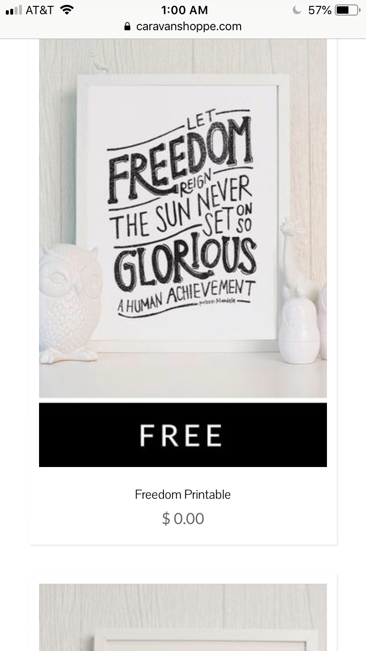
The caravan shoppe website effectively uses Fitt’s law to allow the viewer to move quickly from the design or product being sold, to the purchase button. The button is large and balanced well with the size of the image and is placed in a location that allows the viewer to quickly make a decision and take the next step towards a purchase. When the viewer looks at the product, Fitt’s law provides a successful design using scale and balance to make it easy for the viewer to make a decision. The size of the button in this case is about one fourth the size of the product making it large enough to easily distinguish but without overtaking the focal point.
Law of Similarity
Old Navy
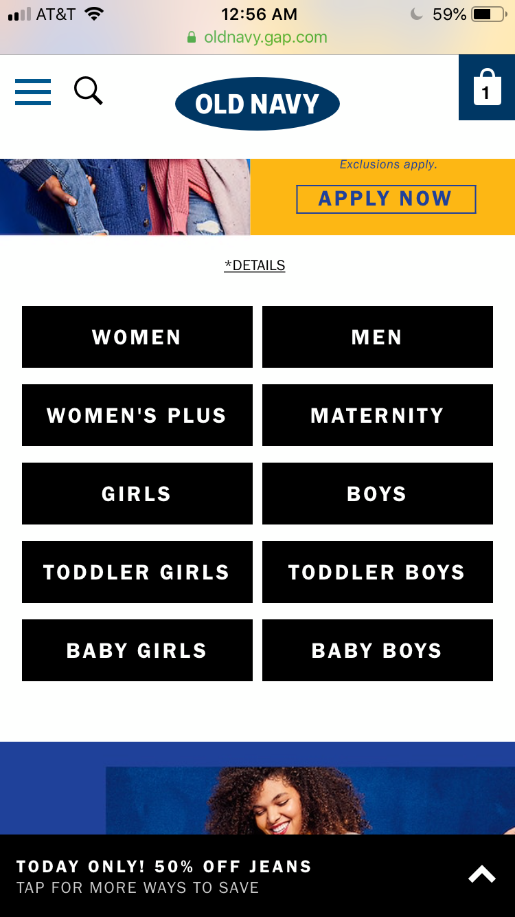
The Old Navy website uses the law of similarity to create a strong focal point and ease of access to the many products offered on their website. Although there are a lot of categories to choose from, this layout provides an easy way for the viewer to make a decision about where they want to look next. The black buttons are similar in size, shape, and color allowing the viewer to easily group the buttons together and read what their options are in continuing through this website. The repetition of the same elements creates unity on this website.
White Space and Clean Design
The Honest Company

The honest company website uses white space and clean design to create space between visuals. The negative space between the images creates balance and contrast. The visual weight from the color of the images to the white of the background creates symmetry and balance allowing the viewer to focus on the products offered and decide what icon to explore next. The contrast of color versus white allows a clear focal point and directs the viewer to the products being sold and the different categories that they can purchase from. The use of these design principles creates a successful design that showcases the premium quality of products being offered and helps create a message that this company is in fact, honest.